
Digital Humanity
Website
Professional
Services.
Professional
Design.
Transforming an agency website into a clear customer journey.

In 2025, Digital Humanity asked me to help take their website from “good enough” to “good business”.
At a glance it didn’t look too bad, but under the surface it lacked the substance, value and intention needed to effectively communicate what the business had to offer.
My challenge was to turn their outdated website into a clear, strategic customer journey.


Content Strategy

Web Design

Visual Design


Some
Context
The Client
Digital Humanity builds high-end websites for their clients. Ironically, their own website hadn’t received the same level of attention in a while. Same tho. 😅
As the business matured, the website became a collection of good ideas rather than a focused customer journey.
The Project
Over time, their website content grew organically, the navigation stopped making sense and the visual design went stale.
They wanted to turn the website into an experience that communicated expertise, built credibility and guided prospective clients towards action.
Read the fine print...
This is a high-level overview featuring selected project highlights, shared strictly for portfolio review purposes.
Some info may be simplified, anonymised, reconstructed, or shown as placeholder content to protect client confidentiality and IP.
This represents a snapshot in time and may not reflect the current state of the product, business, or experience.
Please don’t copy, distribute, or reuse any part of this document without permission.


01The Project
Background & Strategy
The
Challenge
The Problem
Digital Humanity was doing great work. Their website just wasn’t doing a great job of communicating it.
The messaging lacked focus, services weren’t presented as clearly as they could be, and the overall experience made visitors work a little too hard to understand what the business did, why it mattered and what they should do next.
The Ask
I was brought in to assess the existing experience, identify the biggest opportunities and establish a strategic direction for the website. That meant looking beyond individual pages and considering the entire journey — from the first impression through to enquiry.
Constraints
The original engagement was scoped as a much deeper strategic redesign, but budget constraints progressively reduced the available time until the work became a highly compressed sprint.

Project Goals
- Clarify the business proposition.
- Create a more logical information architecture.
- Restructure content around user needs and business goals.
- Create a scalable design foundation.
- Make the path to enquiry clearer.

Business goals
- Better communicate Digital Humanity’s expertise.
- Position the business for higher-value opportunities.
- Make services easier to understand and explore.
- Build credibility through stronger storytelling and social proof.
- Establish a scalable foundation for future content.
Most importantly
The challenge wasn’t just aesthetic.
It was to create a business tool.

Role &
Responsibilities
Content Strategy
Reviewed the existing content, identified gaps and duplication, and restructured the website around clear business objectives and user needs.
Web & UX Design
Reworked the information architecture to create a more intuitive customer journey, with logical user flows, navigation and calls to action.
Visual Design
Evolved the existing visual language into a more mature and cohesive interface, introducing stronger typography, spacing and imagery.
The
Approach
Hypothesis
The website didn’t need to be reinvented. My thinking was to identify where the existing experience was falling short, and to address those issues head-on.
Design Strategy
The plan was to start with the story. I first established what the website needed to communicate, then defined how that narrative should be organised before even opening Figma.
The Process
Because of the compressed timeline, the process was deliberately lightweight and focused: Explore the status quo, plan the plot, generate the content, wireframe the experience, and colour it in.
The Process

Explore

Plan

Write

Wireframe
Visual Design
02Discovery
Seeking to understand
Cognitive
Walk-Through
Understanding the Status Quo
I started with a deep dive into the existing website.
Rather than immediately jumping into solution mode (it’s always so tempting), I looked for places where the experience was creating friction:
- Where was information difficult to find?
- Where was the hierarchy unclear?
- Where was the content obsolete?
- Where was the message getting lost?
- Where were users being asked to make decisions without enough context?
This created a clearer picture of where the biggest opportunities were.
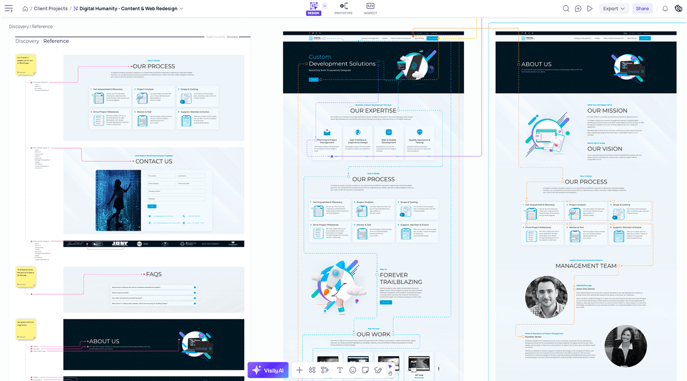
A sample from the discovery mission showing the flows for specific user goals. You can see the Visily board here.
Synthesised
Findings
Turning Observations Into Actions
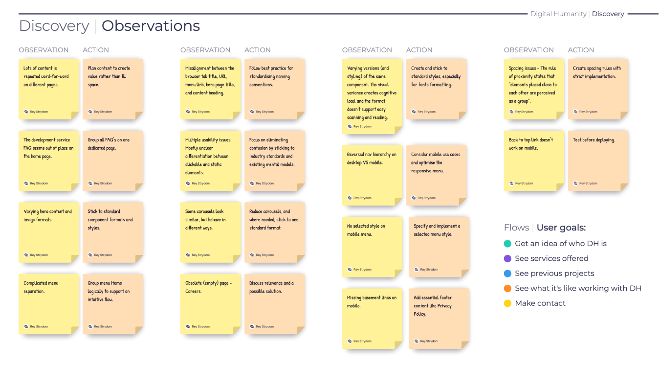
The discovery process was translated into a prioritised set of observations and recommended actions. This was important because it meant the redesign wasn’t driven by subjective preferences. Each decision was backed by evidence and translated into a meaningful improvement.
The result was a practical roadmap for the work ahead.

03Content Strategy
Plotting the Story
The
Narrative
Building a Better Journey
Once the existing experience was understood, I looked at how the website should actually work as a customer journey.
The aim was to create a pathway that answered the questions a prospective client would naturally have:
- Who are you?
- What do you do?
- Can you solve my problem?
- Have you done this before?
- Why should I trust you?
- What happens next?
This became the foundation for the new content strategy and page structures.
Designing the Conversation
Before designing the interface, I designed the conversation.
Every page was mapped against business objectives, user needs and the role it needed to play in the wider journey.
This helped to identify:
- What information belonged where.
- What content needed some love.
- Where credibility needed to be established.
- Where calls to action could assist rather than interrupt.
- How different content types could work together.
The result was a website structure that was much more intentional.
04Creation
Rapid Execution
Content
First
From Strategy to Experience
Once the intended message and high-level structure were established, I developed the content direction around the new direction.
I used AI as a writing partner to accelerate first-pass content generation, but the strategy, structure and editorial decisions remained human-led.
Content Strategy
The goal wasn’t to produce more content. It was to make the content do more work.

A sample of the content planning sheet. If you want to see more, you can check out the full pdf version here.
Solution
Wireframes
Scaffolding the Solution
With the narrative and structure established, I translated the strategy into medium-fidelity layouts.
The wireframes communicated:
- Information placement
- Content relationships
- Navigation
- Page flow
- Calls to action
- Responsive behaviour
- Reusable components
Because of the project constraints, desktop layouts were prioritised, with responsive considerations built into the underlying design patterns.
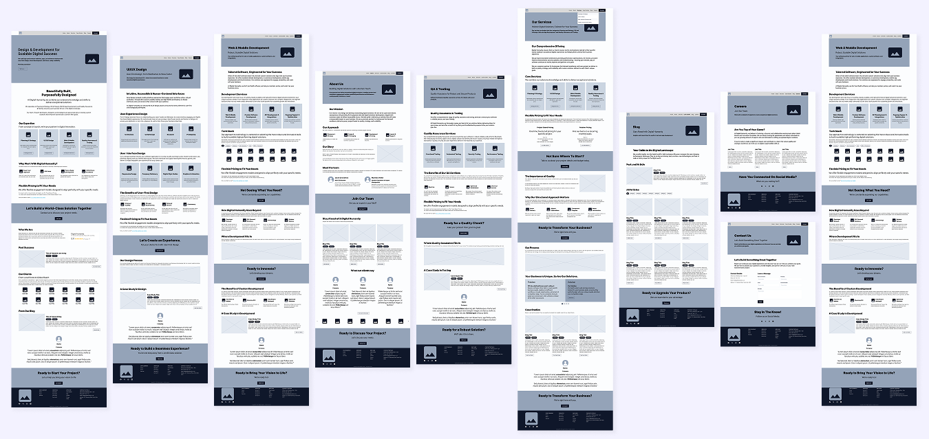
A preview of the wireframes. you can see the Figma file here.
Visual
Direction
High-Fidelity Design
The visual direction strengthened the existing Digital Humanity brand rather than replacing it.
Recognisable elements like their signature gradients and diagonal line patterns stayed, while the overall system was refined through:
- Stronger typography
- More generous spacing
- Cleaner layouts
- More intentional imagery
- Consistent component behaviour
- Improved visual hierarchy
The new look was designed to feel more mature and premium without losing the personality of the brand.
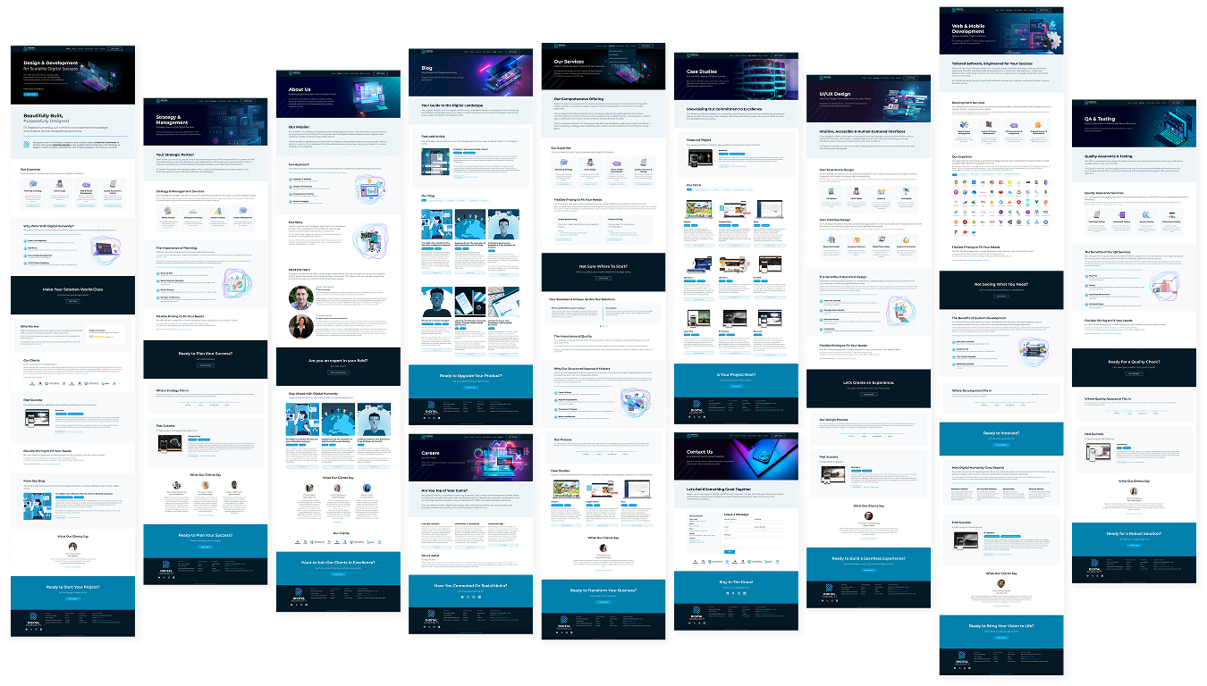
A preview of the high-fidelity designs. You can see it on Figma here.
05Design Showcase
The Solutions
Home
Page
Overview
The home page needed to do more than introduce Digital Humanity. It had to establish credibility, communicate value and give prospective clients a reason to keep exploring.
Goal
Create an intuitive, supported journey from first impression to engagement.
Solution
I restructured the home page around a deliberate sequence that introduced the business, demonstrated expertise, built trust and progressively guided visitors towards deeper pages and enquiry.
Outcome
A home page that felt less like a collection of sections and more like a conversation with a prospective client.
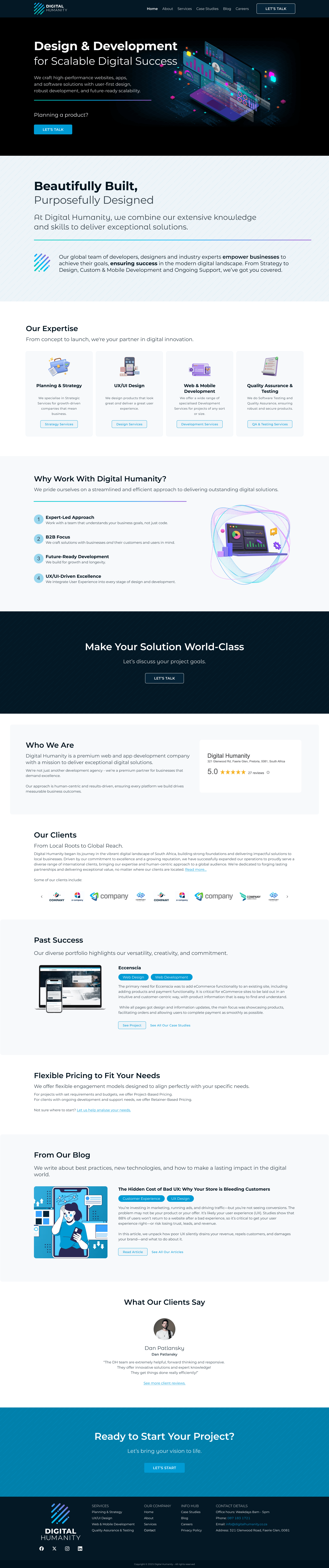
The home page design (scroll to see more).
About
Us
Overview
The existing About page focused heavily on telling a small part of the company’s story. The opportunity was to make it work harder as a credibility-building experience.
Goal
Help prospective clients understand the people, expertise and credibility behind the business.
Solution
The content was reorganised around brand fundamentals, process, leadership, expertise and social proof, creating a more natural progression from company story to evidence of capability.
Outcome
A more human experience that supported the wider customer journey rather than sitting outside it.
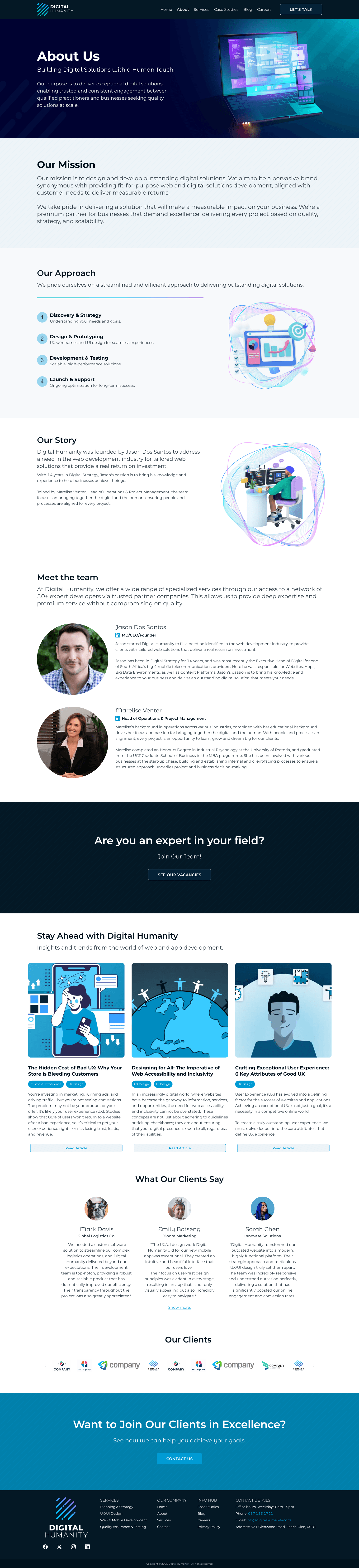
The about page design.
Service
Offering
Overview
Digital Humanity offered a broad range of services, but the previous structure had no centralised summary of the collective company capabilities.
Goal
Make the service offering introduction and value proposition easier to navigate while creating stronger pathways into individual services.
Solution
I introduced a dedicated services hub that grouped related offerings into a clear structure, supported by dedicated service pages.
The system was designed to help visitors understand what Digital Humanity did, and why each service mattered.
Outcome
A strategic service positioning that brought isolated services into a more understandable ecosystem.

The services landing page design.
Specialised
Solutions
Overview
Individual services needed more room to communicate value, process and outcomes.
Goal
Create a flexible landing page pattern that could bend to the nuances of each offering.
Solution
I developed a dynamic page structure based on common client questions like:
- What is it?
- What does it do?
- Why do I need it?
- How does it work?
- What can I expect?
- Are you any good?
- Where do I start?
This created a reusable foundation for existing and future service content.
Outcome
A scalable service page design that could grow alongside the business.

One of the four solution pages. You can see the others on Figma here.
Blog &
Case Studies
Overview
The existing content was gold, but there was an opportunity for it to do more than simply exist.
Goal
Turn content into a long-term credibility and discovery channel with visual appeal and useful interactions.
Solution
I repositioned the blog as a knowledge hub, introducing stronger categorisation, featured content and category filtering.
The same structural approach was used for the case studies page.
Outcome
A content system designed to support expertise, SEO, discoverability and continued publishing.
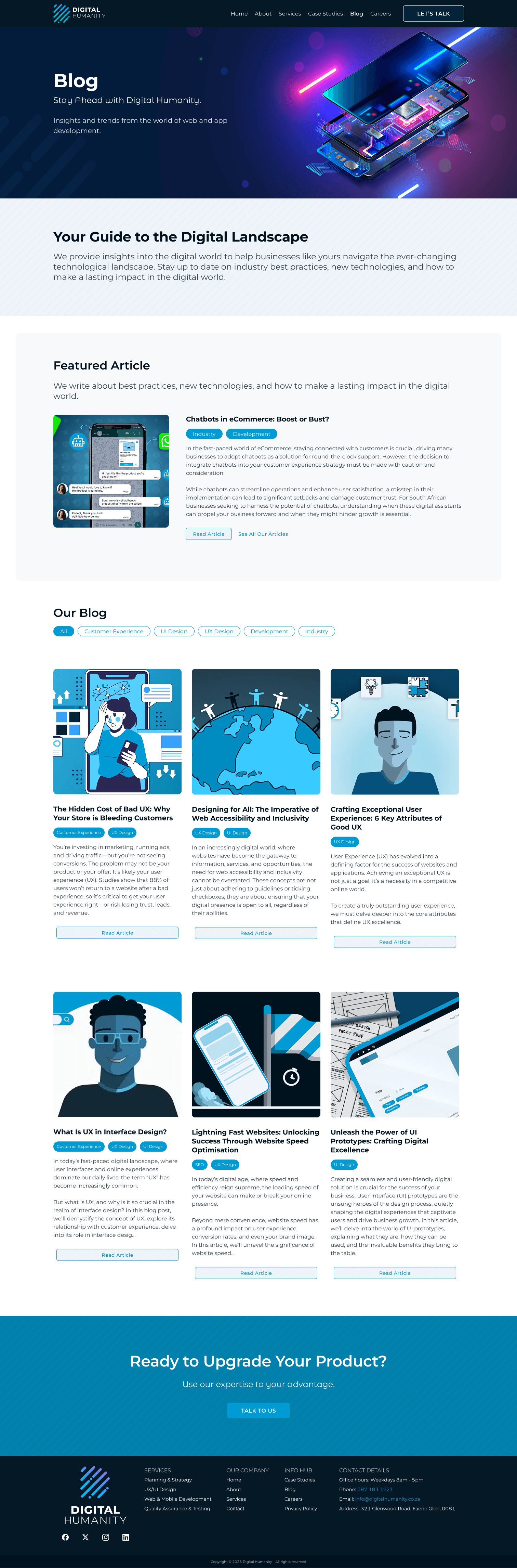
The blog and case study page design.
Career
Opportunities
Overview
As Digital Humanity grew, the website could become a great tool for attracting new talent.
Goal
Create a stronger recruitment experience and position Digital Humanity as a employer of choice.
Solution
I introduced a dedicated careers journey combining company culture, opportunities and supporting social content.
Outcome
A more aspirational recruitment experience aligned with the wider brand.

The careers page design.
Contact &
Connect
Overview
The contact page is where the whole journey comes to a conclusion. It had to do a lot of heavy lifting without feeling heavy.
Goal
Turn interest into action with as little friction as possible.
Solution
The contact page was structured around reassurance, clear contact options and a straightforward enquiry form.
The design guided the visitor to conversion, while assuring them with strategic trust factors.
Outcome
A welcoming conversion point that made it easier for prospective clients to start a conversation.

The contact page design.
06Impact
The Wins
Key Solutions
Delivered
Stronger Positioning
The website better communicated the quality and maturity of the business.
Better Storytelling
Content shifted from explaining features to communicating expertise, trust and outcomes.
Simpler Navigation
Information architecture made services and supporting content easier to discover.
Higher Conversion Potential
Calls to action became intentional, visible and integrated throughout the customer journey.
Scalable Foundation
Reusable components and visual rules created a maintainable and scalable foundation.
Cohesive brand expression
The visual language evolved without losing recognisable Digital Humanity characteristics.
The
Results
The Journey
The biggest constraint was time, so I had to work smart.
Rather than going for a superficial visual redesign, I opted for an approach that would have the greatest impact.
By establishing the content strategy and information architecture first, the visual design could move quickly.
The Outcome
The most notable improvement wasn’t actually the visual design. It was the story the website told.
The redesigned experience created a natural path through the business, established credibility, explained offerings, and demonstrated expertise.
You can see the before and after comparisons here.
Business Impact
The new design resulted in a more strategic website foundation across content, structure and visual design.
It better reflected the quality of Digital Humanity’s work, positioned the business for its next stage of growth, and created a stronger foundation for generating high-value enquiries.
07In Retrospect
Looking Back
Project
Recap
Where We Started
Digital Humanity was an established agency producing exceptional work, but its own website no longer reflected the maturity or ambition of the business.
My Contribution
I brought strategy, content, UX and visual design together to establish a stronger strategy and a clear design direction for the website.
The Brag
Working within a severely compressed timeline, I transformed a loosely structured online presence into a more intentional customer journey — from first impression through to enquiry.
The
Takeaway
Strategy Beats Decoration
Sometimes the best improvement isn’t a flashy glow-up. In this case the real problem was the story behind the visual facade.
An intentional content strategy forms a solid experience, builds trust and drives conversion.
What I Learned
Given more time, I would have pushed for deeper user research, validation and iteration.
This project demonstrated just how much value can still be created when the available time is focused on the right decisions.
My
Reflection
I Made a Really Good Sarmie
Cooking up a Christmas feast takes hours. Making a PB&J takes a minute. Both will fill you up, but one definitely makes a better impression.
Yes, you can redesign a website in a week. But it kind of feels like serving your valued clients a peanut butter sarmie. 😅
Don’t get me wrong — I’m proud of what I managed to pull together in the time available. The project proved just how much can be achieved when you focus ruthlessly on the things that matter most.
But if I’m being honest, I think it could have been a lot better.
Good experience design takes time. Time to understand the business, the market and the target audience. Time to explore different directions. Time to test, question, refine and sprinkle delight.
A one-week sprint can produce something useful. But given the choice, I’d much rather serve the Christmas feast.
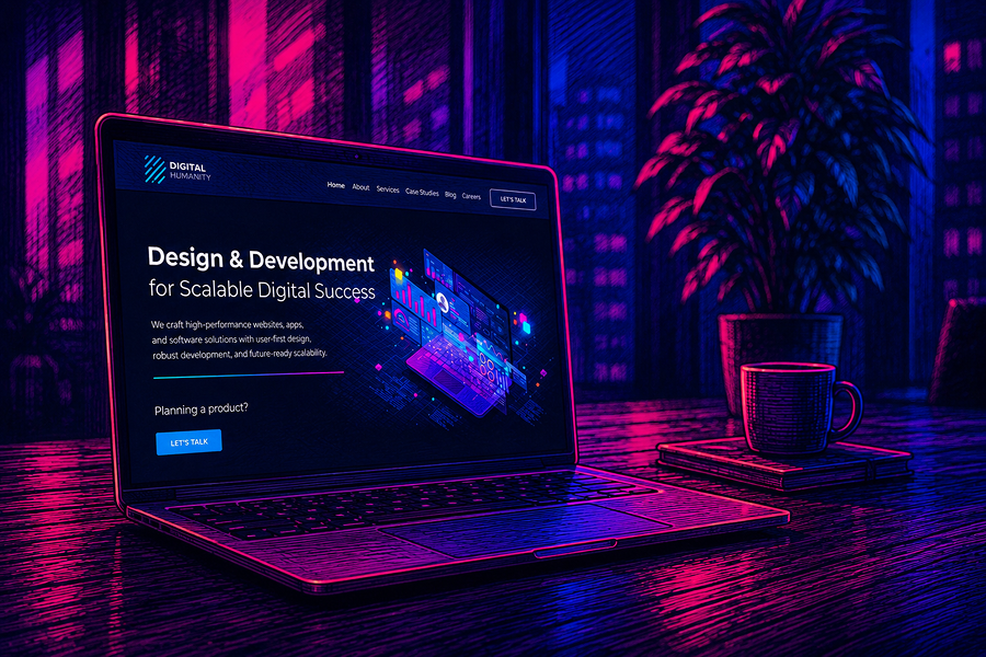
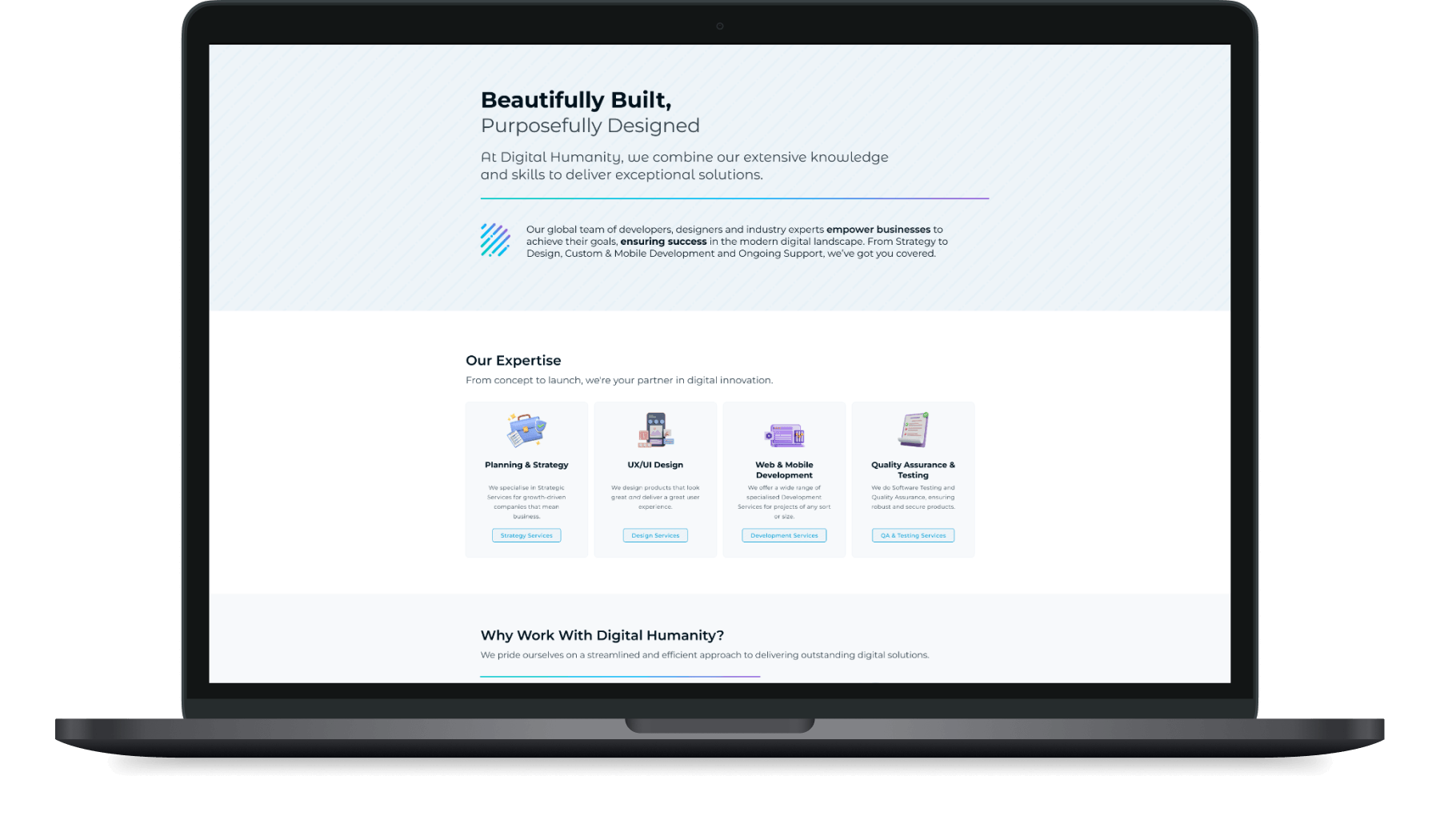
An artistic representation of the Digital Humanity home page.

Hey, you made it! 🤩
Thanks for hanging out all the way to the end.
If your website is somewhere between “good enough” and “this could be so much better”, we should probably talk. Drop me a line, or check out some more of my work.